July 14, 2025
Walk into any public building, and you rely on signs to guide you, inform you, and help you navigate safely. Now imagine doing that without clear visual cues. For millions, that is a daily reality. This is precisely why effective signage, specifically ADA compliant signage, goes beyond mere convenience and ensures genuine inclusivity for every visitor.
The Americans with Disabilities Act (ADA) sets comprehensive standards to make public spaces accessible for all. For your business, ADA compliant signage shows a true commitment to welcoming every individual. Companies that champion not only avoid potential penalties but also enhance their reputation and broaden their customer base.
This article will break down essential aspects of accessible signage, empowering you to navigate the regulations and create effective signs that truly serve all your patrons.
The Essentials of ADA Compliance: What to Know About Accessible Signage
The ADA aims to ensure everyone can navigate public environments independently. This includes clear, legible signs that provide critical information and direction. You'll find ADA compliant signages in permanent rooms, common areas, and throughout egress pathways.
1. Key ADA Compliant Sign Requirements
The ADA details specific technical requirements for signs to guarantee accessibility.
Font and Characters
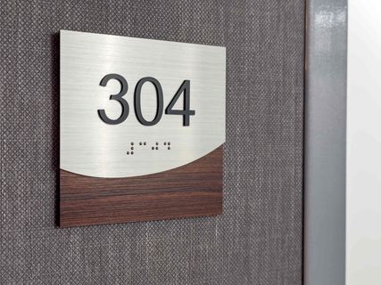
- Sans-serif, Uppercase Text: Always use simple, sans-serif fonts like Arial or Helvetica. All tactile characters on signs identifying permanent rooms and spaces must appear in uppercase letters.
- Character Height and Stroke Thickness: Characters must meet specific height requirements (e.g., 5/8 inch to 2 inches for tactile characters) and stroke thickness to ensure legibility. The stroke should be 10% to 20% of the character height.
Raised Tactile Characters: Signs for permanent rooms and spaces require raised tactile characters, allowing individuals with visual impairments to "read" the sign by touch. These characters must have a minimum height and precise spacing.
Braille
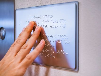
- Grade 2 Braille: Tactile signs must include Grade 2 Braille directly below the raised text. Grade 2 Braille uses contractions, making it more efficient for fluent readers.
- Correct Dot Specifications: Braille dots must be domed or rounded, adhering to strict measurements for height, diameter, and spacing between dots and cells.
Contrast and Finish
- High Contrast: A significant contrast between characters and their background is vital for visual accessibility. The ADA generally recommends a minimum 70% contrast ratio (though newer guidelines may accept 65% for certain applications). Dark characters on a light background or vice versa work best.
- Non-Glare Finish: The sign's surface must have a non-glare finish. This prevents reflections from overhead lights or windows from obscuring text, a common issue for many people, especially those with low vision.
Placement and Mounting
- Mounting Height: Install signs so the baseline of the lowest tactile character sits a minimum of 48 inches from the floor, and the highest tactile character's baseline is no more than 60 inches from the floor. This range accommodates both standing and seated individuals.
- Location Relative to Doors: For rooms with doors, mount the sign on the wall adjacent to the latch side of the door. This consistent placement provides a predictable location cue for people who are blind or have low vision.
Clear Floor Space: Ensure an 18-inch by 18-inch clear floor space around the sign, centered on the tactile characters, and outside the arc of any door swing. This allows unimpeded access for wheelchair users.

International Symbol of Accessibility (ISA)
Pictograms and Symbols
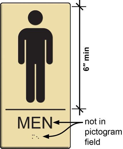
- International Symbol of Accessibility (ISA): Use this universally recognized symbol to indicate accessible features. While the ISA itself is an informational pictogram and does not require tactile text or a 6-inch field, it must meet contrast and non-glare finish requirements.
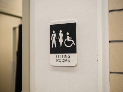
- Pictograms for Permanent Spaces: If a pictogram designates a permanent room or space (e.g., the symbol on a restroom sign indicating male/female, or a symbol used to identify a permanent stairwell), it must have accompanying tactile text and Grade 2 Braille directly below it.
Minimum Field Size for Designation Pictograms: Pictograms designating permanent rooms or spaces must occupy a 6-inch minimum vertical field. Characters and Braille should not be located within this field.
Pictograms, Guide to the ADA Accessibility Standards
2. Common Applications for ADA-Compliant Signage
ADA requirements for signage apply across a facility, particularly for permanent spaces. Understanding these specific applications helps you plan effectively.
Permanent Room Identification
Any sign identifying a permanent room or space needs tactile characters and Braille. This category is broad, encompassing many areas within your building:
- For offices, this means ADA compliant door signs clearly identifying "Human Resources," "Executive Offices," or "Reception."
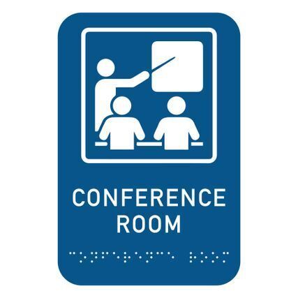
- For conference rooms, you'll need signs such as "Board Room" or "Meeting Room 3" with both visual and tactile elements.
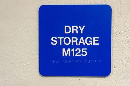
- Storage areas require labels like "Supply Closet" or "Janitorial Storage" to ensure proper identification.
Even mechanical closets or electrical rooms need compliant signs such as "Electrical Panel" or "HVAC Room" for safety and navigation.
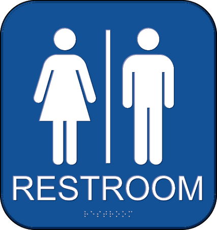
ADA compliant restroom sign, Guide to the ADA Accessibility Standards
Egress and Safety Signage
Clear pathways to safety are non-negotiable. ADA compliant exit signs must include tactile and Braille components, particularly for exit stairways, exit passageways, and areas of refuge. These signs ensure everyone can navigate safely during an emergency.
Wayfinding and Directional Signs
While not all directional signs require tactile elements, they must meet visual accessibility standards like contrast and character size. Signs directing visitors to accessible entrances, elevators, or accessible restrooms help guide users smoothly through your building.
ADA Compliant Braille Signs
Beyond their role on permanent room signs, Braille is essential for elevator controls and other vital interactive elements, ensuring tactile information is available where needed.
3. Beyond Compliance: Designing for Optimal Accessibility & Impact
Meeting ADA regulations is your starting point, but truly effective signage goes further. Think of it as an opportunity to enhance your brand, improve user experience, and make your space genuinely welcoming.
The Value of Custom ADA Signs
While strict guidelines govern ADA compliance, they don't stifle creativity. In fact, custom ADA signs allow you to weave accessibility seamlessly into your brand identity. You can select materials, colors, and finishes that align with your aesthetic while still adhering to all necessary contrast and glare requirements.
This thoughtful approach transforms required signage into an integral part of your interior design, elevating the overall feel of your space.
Choosing the right materials also significantly impacts durability and longevity. For instance, acrylic signs offer versatility and a sleek look, while metal signs provide a robust, premium feel.
Photopolymer is an excellent choice for crisp, precise tactile and Braille elements. Selecting a substrate suitable for your environment—whether indoor or outdoor—ensures your investment lasts and maintains its compliant features over time.
Thoughtful design considers how users interact with and perceive your signs, creating a more intuitive and pleasant experience for everyone.
Why Expertise Matters
Navigating signage compliance can be overwhelming. From mounting heights to Braille translations, even minor errors can lead to inaccessible signs and costly issues. Working with a print solutions provider experienced in ADA signage, like Intermedia Print Solutions, helps you avoid these pitfalls. Our team stays up to date on the latest regulations, ensuring your signage is compliant from initial design to final installation.
Expert installation by Intermedia Print Solutions means every sign is mounted to ADA standards—plus, your project can achieve certificate of occupancy (COA) approval faster, thanks to reduced inspection delays and fewer compliance concerns.
The Importance of a Comprehensive Signage Design Package
Thoughtfully designed and cohesive signage enhances the overall impression of your property, elevating perceived value and fostering a “feel good” response among visitors, tenants, and guests. This is true whether your space is a high-end office, a commercial facility, or an affordable housing property.
Excellent signage design can transform the experience, making tenants feel like they’re living in a luxury environment. When your signage aligns with your brand and creates intuitive, attractive wayfinding, it contributes directly to improved property ROI, increased tenant satisfaction, and a strong sense of community pride.
What Does a Professional Signage Design Package Include?
Most projects lack detailed signage plans in their blueprints. No message schedules, materials, or install locations are specified. That’s where our design package comes in:
- Personalized consultation: We get to know your vision, brand, and goals.
- Conceptual design: Our team creates artwork and, if needed, refines or develops your branding for a competitive edge.
- Detailed planning: We map signage locations and types using advanced software for full transparency and accuracy.
- Easy approvals: Preview and approve designs through our online portal.
Code expertise: We ensure your signs are fully compliant with ADA, fire, and building codes—helping you pass inspections the first time.
Clear budgeting: Once designs are approved, you receive precise production files and investment estimates.
In short, a comprehensive signage design package from IPS means less guesswork, faster approvals, and a seamless experience for everyone who enters your space.
Guiding Your Way Forward
ADA compliant signage actively shapes an inclusive environment for every person entering your space. Focusing on accessibility enhances your brand's reputation and expands your reach within the community. When you prioritize thoughtful design and precise execution, your signage becomes a valuable asset, welcoming diverse audiences and streamlining navigation for everyone.
Successfully implementing accessible signage requires specialized knowledge. From navigating intricate ADA guidelines to ensuring quality custom printing and meticulous signage printing and installations, partnering with an experienced provider simplifies the entire process.
Intermedia Print Solutions recently delivered over 234 ADA-compliant signs for a multi-family property in New Jersey, completing fabrication in less than 10 working days to support rapid COA approvals. See how we did it.