June 16, 2025
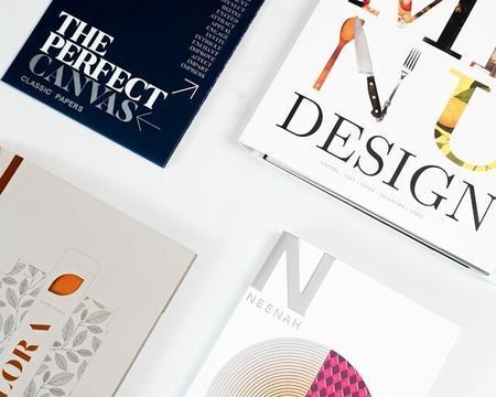
Image via 2H Media on Unsplash
Typography influences how readers perceive a message before they read a single word. In print design, effective typography—including font choices, spacing, and layout—enhances readability, directs attention, and defines brand identity.
Correct typography conveys professionalism and clarity. Incorrect typography hinders comprehension. The importance of typography extends beyond aesthetics and is crucial for creating engaging and effective print materials.
This article will explain typography, why it matters, and its application in print design.
What Is Typography?
Typography is the practice of organizing text to enhance readability, clarity, and visual impact. It involves selecting appropriate fonts, adjusting spacing, and structuring content to direct the reader's attention. Well-executed typography brings a brand's message to life, reinforces brand identity, and ensures content is impactful and memorable.
Key elements of typography include:
- Fonts and typefaces
- Size
- Spacing (leading, kerning, tracking)
- Alignment
- Hierarchy
- Contrast and color
- White space
Typography in print vs. digital media
While typography adheres to similar design principles across print and digital platforms, each medium presents unique considerations. Print typography offers a tactile experience, where the paper texture, ink quality, and lighting conditions influence the text's appearance.
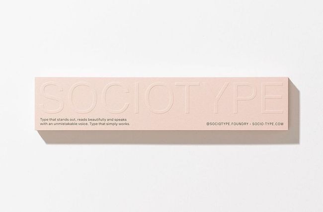
Image via TYPE01
Conversely, digital typography must adapt to various screen sizes and resolutions to ensure accessibility and readability across a wide range of devices. Regardless of the medium, effective typography ensures your message is clear and impactful.
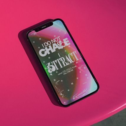
Image via TYPE01
For instance, with advancements in digital printing and custom printing, designers can seamlessly translate on-screen typography into high-quality print materials, maintaining sharpness and brand integrity from screen to paper.
Why Is Typography Important in Print Design?
Typography significantly shapes how an audience perceives printed materials and processes information. Here's how it directly influences communication and engagement:
1. Enhances readability and communication
Clear, well-structured typography ensures that your message is easily understood. Proper font selection, size, and spacing improve legibility, particularly for extended content such as magazines, manuals, and promotional materials.
Meanwhile, poor typography—such as cluttered text, excessive decorative fonts, or inadequate line spacing—creates a difficult reading experience, reducing engagement and diminishing material impact. When it comes to signage printing, for example, bold, high-contrast typography ensures visibility from a distance, making the message clear at a glance.
2. Strengthens brand identity
Typography can define a brand's personality. Consistent typography across all printed materials, from business cards to advertisements, reinforces brand recognition and professionalism.

Image via TYPE01
For instance, luxury brands often use sleek, elegant serif fonts, while modern tech companies favor clean, minimalistic sans-serifs. In labels and packaging, typography plays a critical role in product differentiation, conveying essential details, and influencing purchasing decisions.
3. Creates visual hierarchy and impact
Effective typography directs the reader's eye and highlights key information. Designers establish a clear hierarchy through variations in font size, weight, and style, ensuring critical details stand out.
- Headlines capture attention and establish the tone.
- Subheadings break down information into digestible sections.
- Body text maintains high legibility for sustained reader engagement.
A balanced typographic hierarchy for printed materials should appear organized and professional, preventing them from looking cluttered or overwhelming.
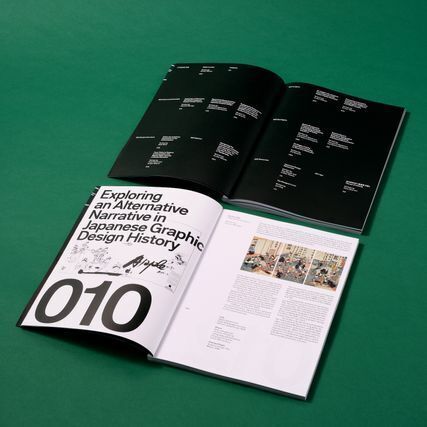
Image via TYPE01
4. Influences audience perception
Typography has a direct impact on how your brand and message are perceived. Polished, well-structured typefaces convey quality and credibility, whereas poor font choices can make materials appear unprofessional.
For example, a high-end restaurant menu using a refined serif font exudes elegance, while a misaligned or overly decorative font can seem unrefined. Thoughtfully chosen typography complements the content and layout, creating a visually harmonious and balanced design.
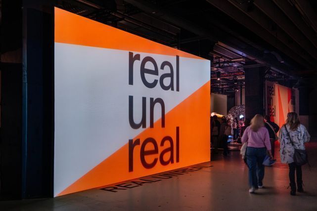
Image via TYPE01
5. Elicits emotional responses
Typography is a powerful storytelling tool that evokes emotions and influences behavior. A playful script font can create a sense of fun and approachability. In contrast, a strong, bold typeface can inspire confidence and action.
When used strategically, typography can persuade, excite, or comfort your audience, enabling them to engage meaningfully with your brand. Whether a call to action on a poster or an elegant invitation, appropriate typography helps shape the desired emotional response.
6 Typography Best Practices for Effective Print Design
Effective typography makes your message visually appealing and easy to read. Here are the best practices for refining your print typography:
1. Choose the right typeface for the message
Fonts establish the tone for your brand's message, influencing audience perception of your printed materials. Serif fonts convey elegance and tradition, making them suitable for brands that aim for sophistication and heritage. On the other hand, sans-serif fonts project a modern, minimalist feel, often associated with innovation and contemporary design.
Limit typeface selection to two or three complementary fonts to ensure a cohesive and visually harmonious look. Align font styles with the emotions you wish to evoke—sleek sans-serifs for cutting-edge brands and classic serifs for refinement.
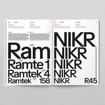
Image via TYPE01
Prioritize simplicity over excessive embellishment to maintain a polished, high-end appeal that enhances readability and professionalism.
2. Prioritize readability with proper spacing
Typography should be easy to read at a glance, allowing your audience to absorb your message effortlessly. Adjusting spacing elements—kerning (letter spacing), tracking (word spacing), and leading (line spacing)—refine text clarity and readability.
An optimal size of 9-12 points for body text ensures comfortable reading. Additionally, sufficient contrast between text and background is crucial for clear visibility, preventing words from blending into the design.
Avoid tightly packed letters, which can feel cramped, and excessive spacing, which disrupts the natural reading flow. Fine-tuning these elements creates a visually balanced and reader-friendly print design.
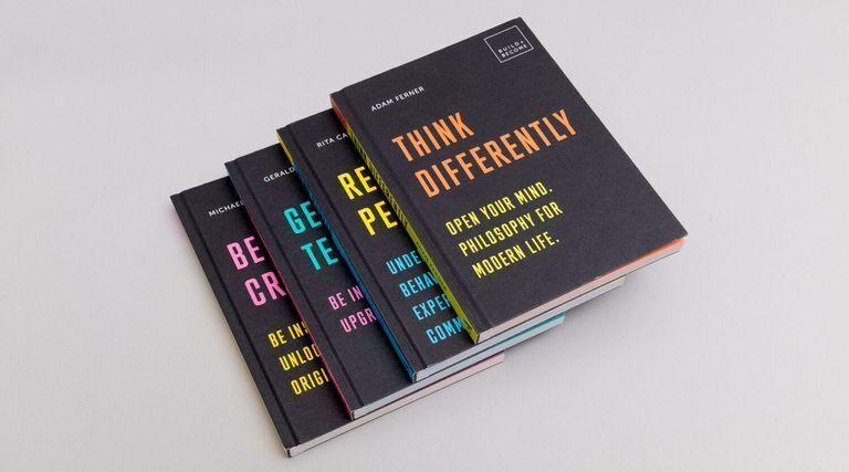
Image via TYPE01
3. Establish a clear hierarchy
Typography should guide the reader's eye naturally, directing attention to key information and creating a seamless reading experience. A well-structured hierarchy improves readability by clearly distinguishing between different text elements.
Headings should be bold and attention-grabbing, immediately drawing focus to essential points. Subheadings should be distinct yet complementary to the body text, providing a smooth transition between sections. Varying font sizes and weights help create a natural reading flow, which highlights critical details while maintaining overall visual harmony.
4. Ensure consistency across materials
Typography is integral to brand identity, shaping how your audience perceives your business. Consistent use of the same fonts across all printed materials reinforces professionalism and enhances brand recognition.
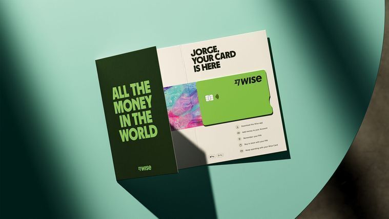
Image via TYPE01
To maintain cohesion, align typography choices with brand guidelines for a unified and polished look. Using the same font families across brochures, business cards, and signage creates a seamless visual identity that strengthens your brand's presence. Avoid excessive font variation, as too many typefaces can appear disorganized and dilute brand impact.
5. Test typography before printing
Typography often appears differently in print than on a screen, making pre-print testing essential. Printing test samples allows for checking font legibility on physical materials.
Factors such as paper type, print resolution, and color contrast can significantly impact readability; glossy or textured papers can affect text sharpness, while insufficient contrast makes words difficult to distinguish.
Image via TYPE01
Consider how text appears in various lighting conditions to maintain clarity in multiple environments. Utilizing the proper digital printing techniques helps preserve typography precision, delivering sharp, high-quality results that enhance the overall impact of your printed materials.
6. Use color strategically
Color plays a significant role in the impact of typography, influencing both readability and emotional response. High-contrast text, such as black on white, creates a bold and striking effect, while low-contrast combinations, like light gray on white, offer a more subtle and refined aesthetic.
Image via TYPE01
To ensure clarity, establish a strong contrast between text and background, making it easy to absorb information at a glance. Furthermore, consider color psychology—warm hues evoke energy and warmth, while cool tones exude sophistication and calm.
When selecting a color scheme, ensure that the text remains legible even in grayscale, thereby preserving readability across various formats and printing conditions.
Let Your Words Make a Statement—In Style
Ultimately, typography is a foundational element of effective print design. It directly impacts how your message is perceived, understood, and remembered. Prioritizing clear typeface choices, precise spacing, and a well-defined visual hierarchy can make your printed materials both visually appealing and highly functional. Master these principles, and your designs will communicate with clarity, strengthen your brand, and resonate deeply with your audience.
Ensure your printed materials speak volumes with Intermedia Print Solutions. From sleek signage printing to premium labels and packaging, we turn typography into an art form—sharp, stylish, and effective.
Let your words leave a lasting impression. Place an order today!