May 18, 2026
Key Takeaways
Color Management in printing bridges the gap between digital designs and physical materials. Colors shift because ink reacts differently to various papers, finishes, and lighting environments during production.
- Physical materials and surface finishes change the final result.
- Environmental factors and lighting shift how viewers perceive color.
- Proactive planning and verification steps guarantee professional brand consistency.
You approve a carefully designed campaign on your bright monitor. The files go to the vendor, and weeks later, the physical collateral arrives. The signature blue on your paper mailers looks noticeably different from the plastic storefront signage you ordered last month. You wonder what went wrong. Keeping your brand colors consistent across a multi-piece campaign builds a strong, recognizable identity.
Yet, demanding absolute uniformity creates friction between marketing teams and vendors.
A specific hue that pops on a digital screen looks flat on an uncoated postcard. That same hue shifts when stamped onto a fabric banner. Physics and chemistry dictate a different reality. Effective brand color management bridges the gap between digital expectations and physical limitations.
This article explains the mechanics behind print output variations. You'll see how substrate differences, coating finishes, press technology, and ambient lighting can alter your corporate design colors. We outline the reasons behind these physical shifts and provide straightforward steps to help you confidently prepare your next print run.
What is Color Management in Printing?
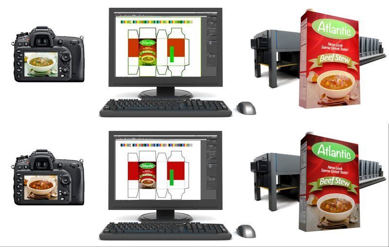
Color management is the controlled, systematic process of translating colors from a digital environment into a physical print format to achieve the closest possible match. This system relies on specialized software profiles to convert the luminous light emitted by your computer monitor into the precise physical ink values required by a commercial press.
Understand the fundamental gap between screens and physical paper:
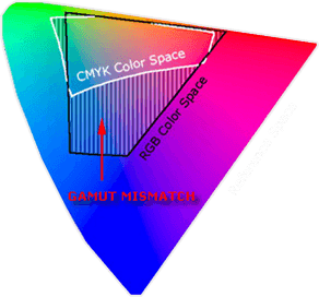
- RGB reality: Screens emit light using the Red, Green, and Blue color model. Your monitor natively displays a massive spectrum of vibrant, highly saturated shades.
- CMYK limitation: Presses deposit physical pigment using Cyan, Magenta, Yellow, and Key (Black). Standard ink on paper simply cannot replicate that entire digital spectrum.
- Gamut constraints: When you export a design file, color management protocols calculate the most accurate physical match for your digital hues. Specific bright neons and rich navy blues often fall outside the printable gamut. The software must substitute them with the closest available CMYK alternatives, which inherently alters the artwork.
Effective color management in printing anticipates these mathematical shifts before production begins. If your project demands absolute precision and standard CMYK conversions fall short, vendors bypass the four-color blending process entirely. They utilize the Pantone Matching System (PMS). You specify a standardized Pantone code, printer then applies a pre-mixed, specific ink formula to the substrate. This guarantees a highly predictable result.
Why Your Brand Colors Don't Match
Several physical variables dictate how ink behaves once it leaves the digital realm. These factors help you predict the final output and adjust your expectations accordingly.
Source: X-rite
Substrate differences
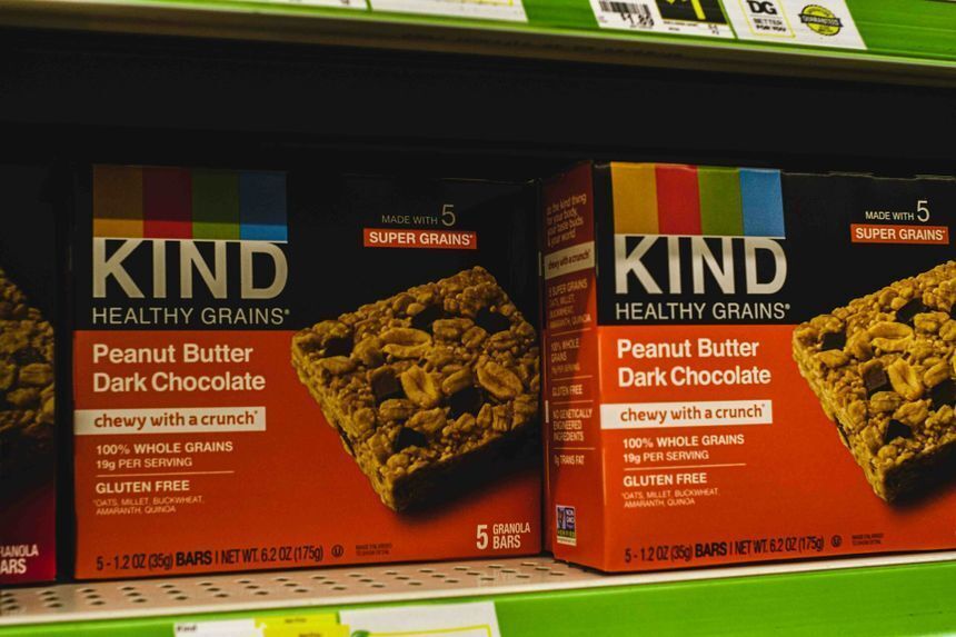
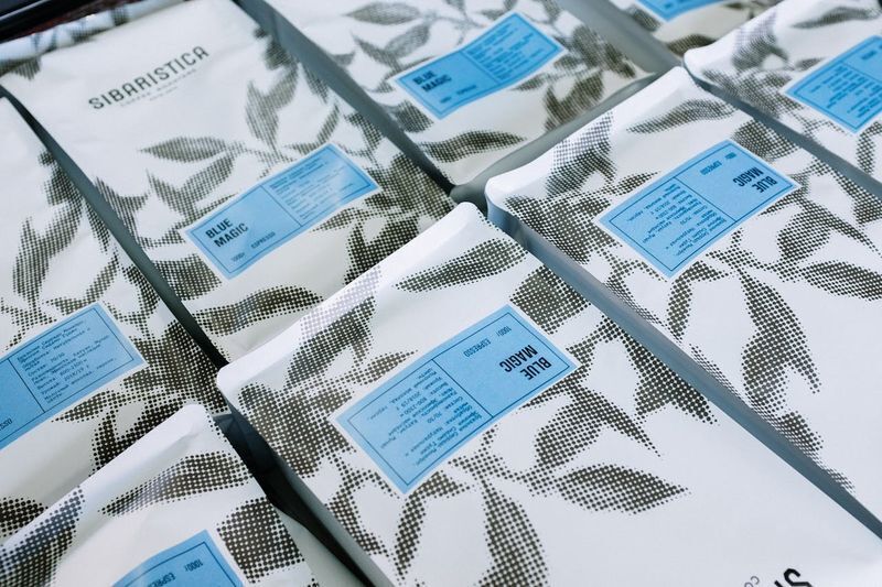
Paper type heavily influences ink absorption. Uncoated paper acts like a sponge. It pulls the liquid ink deep into the fibers and creates a muted, softer appearance.
Meanwhile, coated paper holds the ink right on the surface. This produces a sharper, significantly more vibrant result. Printing that identical CMYK formula on rigid plastics or woven fabrics yields completely different visual textures.
Coating finishes
Adding a protective layer can alter light reflection. For instance, a high-gloss UV coating acts like a mirror, intensifying the perceived color depth and boosts contrast. Matte or soft-touch laminates diffuse light instead. These print finishes flatten the image and make dark tones appear noticeably lighter.

Press technology
Print vendors utilize different machines for different jobs. Offset presses transfer wet ink via rolling rubber blankets. Digital presses fuse dry toner or spray liquid ink directly onto the sheet. Furthermore, a vendor calibrates each machine independently. Running the exact same file on two different presses will naturally display slight variations.
Ink density
The physical volume of pigment that hits the paper changes the final hue. A heavy application of cyan creates a deep, dark blue. In contrast, a lighter application of that exact same pigment reads as a pale sky blue.
Operators adjust density levels during a run to maintain consistency, but these slight mechanical adjustments occasionally cause shifts within the same batch.
Ambient lighting
Environmental light drastically changes color perception. Your team reviews a physical proof under fluorescent office lights and approves the match. A customer later views that printed mailer under natural sunlight, and the hue looks entirely different. This phenomenon, called metamerism, occurs because distinct light sources reflect different wavelengths off the printed surface.
Navigating these physical variables requires a knowledgeable partner. When you trust Intermedia Print Solutions with your commercial printing, you eliminate the guesswork. Our team evaluates your design files directly against your chosen substrates. We help you produce color-consistent marketing materials and accurate product packaging that perfectly match your visual identity across every material.
How to Choose Colors for Your Brand:
4 Key Strategies to Ensure Consistency Knowing how to choose brand colors effectively requires planning for multiple physical mediums right from the start. Consider these practical steps to maintain uniformity across your campaigns.
1. Build a versatile brand color palette
Don’t rely solely on RGB values. Define the exact CMYK breakdowns and Pantone (PMS) codes simultaneously as you establish your corporate identity. The best brand colors translate seamlessly across digital screens, offset paper presses, and rigid signage materials.
2. Use standardized references
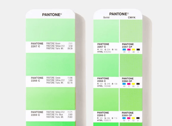
Physical swatch books provide an objective target. A Pantone Color Bridge guide shows you exactly how a solid spot hue looks when converted to standard CMYK ink. You see the side-by-side visual comparison on both coated and uncoated paper. This physical tool quickly eliminates subjective screen-based debates.
3. Request hard proofs
Never approve a massive run based entirely on a digital PDF. Ask your vendor for a physical proof produced on the actual production substrate. This hard copy reveals exactly how the pigment interacts with the material texture and any applied protective coatings.
4. Establish a visual hierarchy
Once you learn how to pick the best brand colors, you’ll find that it involves clear prioritization. Identify your non-negotiable primary hues that strictly require exact Pantone matching. Assign secondary accent shades that can tolerate slight visual shifts in standard four-color reproduction. You can save budget on extensive collateral runs while protecting your core identity.
Secure Your Visual Identity
Color variation represents a physical reality of production. You control the final outcome by planning for material limitations during the initial design phase. Standardizing your references and evaluating physical hard proofs prevents costly production surprises. Aligning digital expectations with the actual behavior of ink guarantees your campaigns look intentional and professional across every medium.
Translating precise digital hues onto physical materials requires exact execution. Intermedia Print Solutions provides dependable printing services to manage these complex variables for you. We evaluate your files against your chosen substrates to produce accurate custom product packaging, vibrant direct mailers, and durable POP displays. As experienced printers in New Jersey, we help companies maintain total brand uniformity across extensive multi-piece projects.
Request a quote or place your order today to secure consistent results for your next campaign.
Color Management in Printing: FAQs
What is color management in printing?
Color management in printing is the process of coordinating digital designs with physical ink values on a press. This system ensures your brand color palette remains consistent across various marketing materials and paper types, effectively bridging the technical gap between your monitor and the final product.
Why do my brand colors look different after printing?
Inconsistencies occur because different materials absorb ink uniquely. Uncoated papers pull pigment into fibers for a muted look, while glossy finishes keep ink on the surface for higher vibrancy. This physical interaction fundamentally changes how a viewer perceives the final printed hue.
How to choose brand colors for consistency?
Define your identity using specific CMYK and Pantone (PMS) codes alongside RGB values to account for physical reproduction limits. Use a Pantone Bridge guide to preview how these colors shift when moving from digital screens to physical media.
How does lighting affect printed brand colors?
Lighting changes color perception through metamerism, where a hue looks identical under office lights but different in natural sunlight. Always review physical proofs in the intended display environment to account for these shifts and maintain your brand color management standards.
Why are physical proofs better than digital PDFs?
Digital PDFs only simulate colors on a backlit monitor. A physical proof is an essential verification step that provides a tangible preview to prevent expensive production errors before a large-scale run.
- Proofing types: Standard Epson proofs reliably simulate the final product's look and feel. For complex, high-end projects, vendors use an offset "press proof" to show exactly how pigments interact with specific substrates and finishes.