June 15, 2026
Key Takeaways
Effective office branding and wayfinding signage design transform confusing layouts into intuitive, engaging workspaces. Balancing these elements ensures smooth navigation, cultural alignment, and compliance.
- Reflect company culture and values using strategic architectural graphics.
- Reduce visitor confusion with clear, intuitive directional markers.
- Audit your space and select durable materials for high-traffic zones.Meet strict safety standards and manage distracting ambient noise.
- Audit your space and select durable materials for high-traffic zones.
Running a commercial facility requires a balance between regulatory compliance and an environment where people actually want to work. If a confusing layout leaves visitors lost or daily operations stall at poorly marked intersections, the workspace quickly turns into a frustrating obstacle. Smart visual communication fixes these bottlenecks. Applying reliable wayfinding design principles establishes intuitive paths through the most complicated floor plans. Alongside basic navigation, accurate regulatory markers ensure buildings meet rigorous accessibility standards. Deliberate graphics also root a company's identity directly into its architecture—with workplace research linking spatial design to higher employee engagement. This guide breaks down the essentials of a highly functional visual workspace. We cover practical ways to inject culture into physical environments, foundational signage frameworks, and compliance protocols. We also outline material durability considerations and provide a site audit checklist to help pinpoint immediate upgrade opportunities across any property.
High-Impact Office Branding Ideas for Company Culture
The moment people step off the elevator, the physical space should immediately reflect the organization's core values. Facility managers can elevate plain architecture and solve common environmental challenges through targeted visual applications:
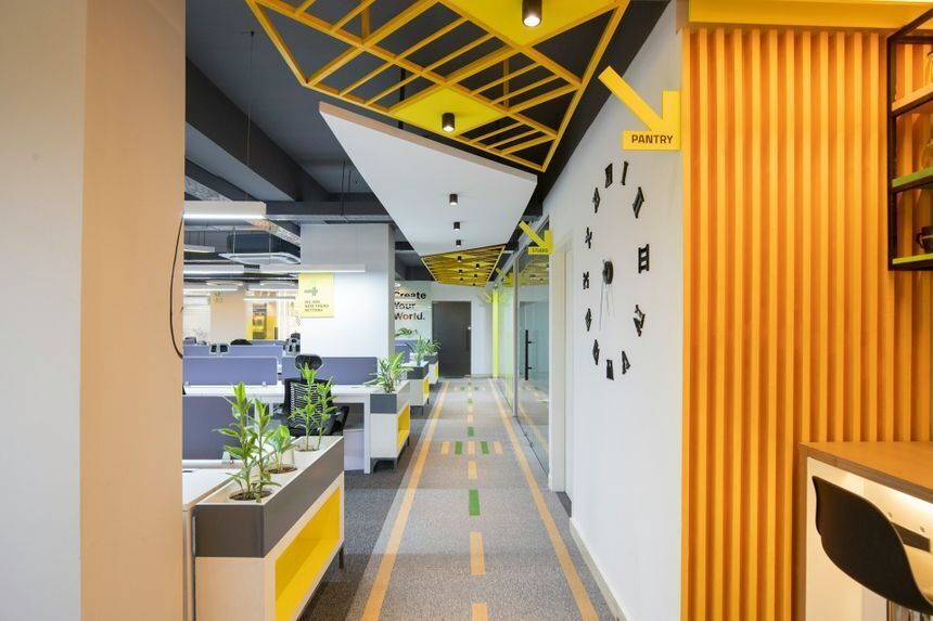
1. Maximize blank wall space
Standard paint often leaves a room feeling sterile, and recent research confirms physical surroundings heavily influence organizational culture. Large-scale office wall graphics can inject energy into high-traffic areas. Meanwhile, custom vinyl murals easily change dull lobbies into vibrant visual narratives.
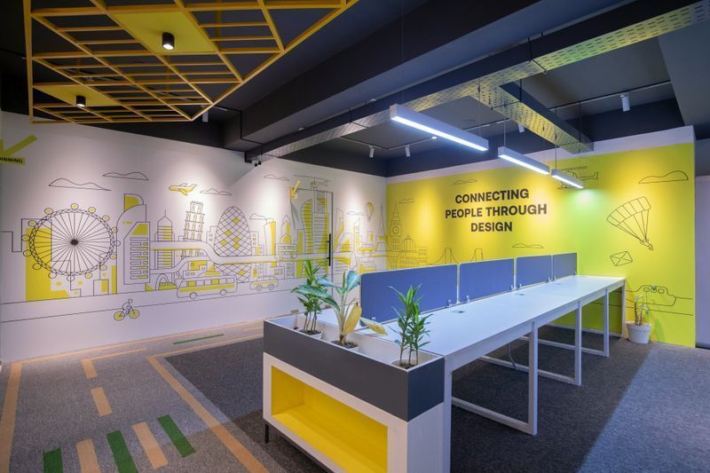
Skip the generic framed stock photography and display dynamic company timelines, abstract local cityscapes, or bold illustrations of recent achievements.
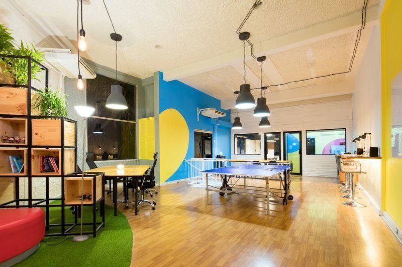
2. Activate glass surfaces
Glass-walled conference rooms look sleek but frequently lack privacy. Frosted vinyl films solve this problem and introduce another layer of design. Incorporate brand patterns, logos, or subtle geometric shapes directly into the window frosting.
This approach maintains natural light flow throughout the floor plan. Studies consistently link access to daylight with higher productivity and better overall mood.
3. Embed core values visually
Companies lose their foundational principles when they bury them inside thick employee handbooks. Bring those statements out into the open. Typography-driven office branding turns abstract mission statements into tangible architectural focal points.
Consider installing dimensional letters or sleek cut-vinyl phrases in collaborative zones. This physical integration reinforces the company vision organically during daily routines.
4. Utilize printed acoustic panels
Open floor plans notoriously amplify background noise. Administrators can tackle these auditory issues and aesthetic gaps simultaneously since modern sound-absorbing materials accept high-resolution graphics. Wrapping acoustic baffles in brand colors or subtle textures serve as an architectural highlight that meets GSA standards for workspace acoustics.
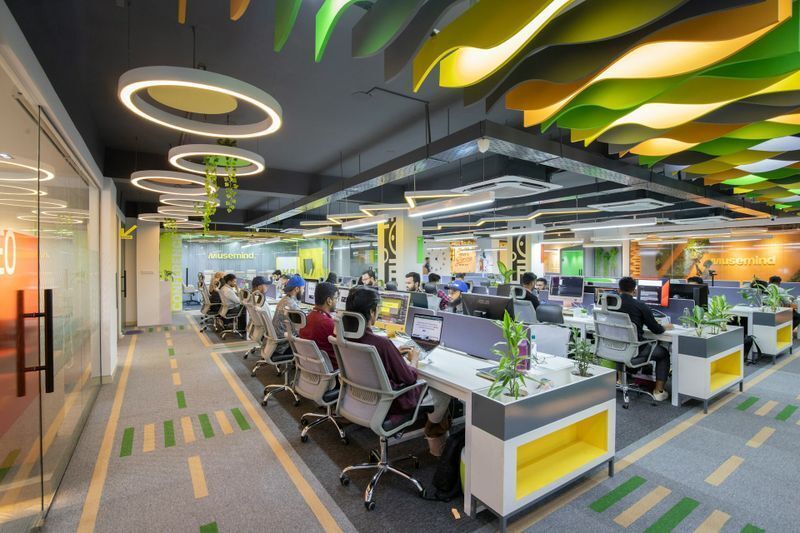
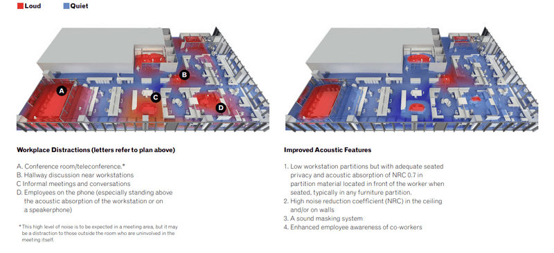
Image from the General Services Administration (GSA)
Targeting these acoustic red zones with customized ceiling panels dampens sound effectively. This approach mitigates auditory disruptions while reinforcing visual navigation cues exactly where employees interact the most.
5. Harmonize aesthetics and function
Mismatched designs between artistic murals and basic navigation tools simply confuse visitors. Ensure that bold cultural graphics collaborate seamlessly with directional markers. To guarantee a cohesive environment, establish a uniform material palette across every installation.
Planners frequently rely on color psychology principles to map out distinct zones efficiently. Designers often apply calming blues to quiet focus rooms and reserve energetic oranges for active brainstorming hubs.
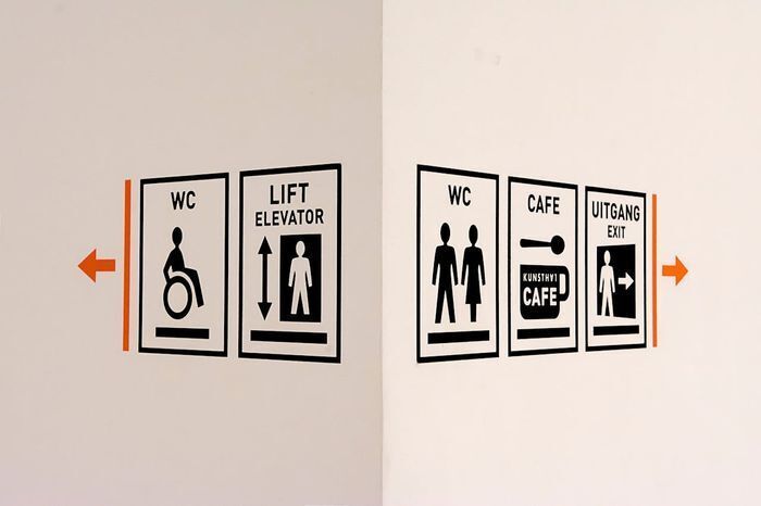
What is Wayfinding Signage?
Wayfinding signage are the visual systems and architectural cues that help individuals orient themselves and navigate complex environments. While branding establishes the overall feel, this clear navigation dictates exactly how successfully occupants interact with that physical space.
Benefits of wayfinding signage
Reduces cognitive load: Visitors process directions instantly without breaking stride or asking for help. Improves traffic flow: Strategic visual cues eliminate bottlenecks at busy intersections and elevator banks. Ensures safety: High-contrast markers guarantee occupants can locate emergency exits and restricted zones immediately.
Wayfinding Signage Design & Compliance: Core Elements
Effective navigation eliminates friction by answering three fundamental questions the moment a visitor walks through the door:
- Where am I? (Orientation)
- Where am I going? (Destination)
- How do I get there? (Route)
To prevent visual clutter at eye level, successful floor plans use a multi-surface approach. Durable floor graphics naturally nudge visitors toward reception desks or outline safety perimeters around restricted zones. This keeps primary sightlines clean while maintaining explicitly clear paths.
Image from MIT via Metropolis Magazine
Signage framework reference
Implementing a complete system requires specific sign types for different operational zones. Use this table to map out facility requirements:
| Sign Category | Primary Function | Common Applications |
|---|---|---|
| Identification | Confirms arrival at the correct destination | Room names, department titles, restroom plaques |
| Directional | Guides traffic flow toward specific locations | Corridor arrow plaques, floor decals, overhead signs |
| Informational | Provides broad facility details and orientation | Lobby directories, campus maps, hours of operation |
| Regulatory | Enforces safety rules and access restrictions | Maximum occupancy markers, fire exits, warning signs |
Safety and compliance
Visual communication also overlaps heavily with strict legal requirements. Facility managers standardize aesthetics to meet non-negotiable federal regulations.
- Accessibility standards: The Americans with Disabilities Act (ADA) dictates specific visual criteria for permanent rooms. These mandates include tactile characters, braille, and high-contrast text
- Emergency protocols: Organizations must follow structural guidelines like the NFPA Life Safety Code to guarantee fire exits remain highly visible during power failures.
Learn how to successfully implement these requirements across your facility in our related guide: Things to Know About ADA-Compliant Signage
Choosing Durable Materials for High-Traffic Areas
Visual appeal means nothing if an installation degrades after three months. Match substrates directly to the environmental demands of each specific zone:
Heavy-duty floor applications
Floor graphics in high-traffic corridors take a constant beating from heavy footfalls, industrial cleaning equipment, and rolling utility carts. Administrators must specify slip-resistant, laminated vinyl engineered specifically for ground applications. Prioritizing these textured finishes prevents edge curling and helps facilities maintain compliance with OSHA walking-working surface regulations.
Resilient wall coverings
Vertical surfaces face entirely different threats—scuff marks, direct sunlight, and daily physical contact can destroy basic print media. Low-touch architectural features might only require standard cut vinyl.
Conversely, busy lobbies and narrow hallways benefit immensely from durable Type II commercial wallcoverings. Adding a protective overlaminate shields vibrant office wall graphics from premature UV fading and aggressive chemical cleaners.
Material failure quickly undermines even the best office branding strategy. Partnering with experienced commercial printers like Intermedia Print Solutions secures the exact vinyl weight, adhesive tack, and protective finish your architecture demands. Our large format printing and graphics installation services guarantee material longevity and exact color accuracy across heavy-duty floor markers, custom wall murals, and delicate window films.
Your Site Audit Checklist
A successful workspace transformation begins with a clear assessment of your current layout. Facility managers should walk the building floor to identify navigational bottlenecks, missing regulatory markers, and unutilized structural surfaces. Use this checklist to evaluate your property's visual ecosystem and build out an actionable upgrade plan:
| Audit Zone | Action | Status |
|---|---|---|
| Regulatory & Safety | Confirm permanent rooms feature ADA-compliant tactile lettering and grade 2 braille. | [ ] |
| Verify emergency exit paths and fire equipment have high-visibility markers. | [ ] | |
| Check room plaques for accessible, non-glare, high-contrast text. | [ ] | |
| Traffic Flow | Assess the main entrance. Is the reception desk immediately obvious? | [ ] |
| Walk major corridors to ensure directional signs remain clearly visible from 30 feet away. | [ ] | |
| Identify intersections that could benefit from guiding floor decals | [ ] | |
| Aesthetics & Culture | Locate acoustic hotspots to install GSA-compliant sound-absorbing, printed baffles | [ ] |
| Evaluate glass-walled rooms for missing privacy frostings or branded window films. | [ ] | |
| Scan lobbies and breakrooms for blank walls ready for custom office wall graphics. | [ ] | |
| Confirm cultural displays share a cohesive color palette with primary navigational tools. | [ ] |
The Clear Path Forward
Smart visual strategies turn standard offices into functional assets. Combining intuitive navigation with intentional branding eliminates daily friction, ensures compliance, and creates a space where teams thrive.
Executing this balance requires production expertise. Intermedia Print Solutions delivers comprehensive commercial printing capabilities tailored to various facilities. From initial production utilizing crisp large format printing solutions to selecting durable print finishes for high-traffic zones, our teams handle every detail with absolute precision. IPS manages your technical layout requirements alongside flawless graphics installation to ensure your physical property seamlessly mirrors your design vision.
Executing this balance requires proven production expertise. Intermedia Print Solutions delivers commercial printing built for demanding facilities. We handle every detail with precision—from crisp large format printing to durable print finishes for high-traffic zones. Add our flawless graphics installation, and ensure your physical space perfectly matches your design vision.
Ready to upgrade your visual ecosystem? Contact our team today to request a quote or place your custom order.
Office Branding & Wayfinding: FAQs
What is wayfinding signage in an office?
Wayfinding signage encompasses the visual systems and architectural cues that guide individuals through complex physical spaces. It reduces cognitive load, improves traffic flow, and ensures visitors easily locate their destinations and emergency exits.
How does office branding improve company culture?
Office branding visually embeds a company's core values directly into the physical workspace. Using custom wall graphics, dimensional letters, and frosted glass murals transforms sterile architecture into an engaging environment that naturally reinforces corporate identity.
What are the ADA rules for office signs?
The Americans with Disabilities Act (ADA) requires specific visual criteria for permanent room signage to guarantee accessibility. Facility managers must include tactile characters, Grade 2 braille, and non-glare, high-contrast text on these specific regulatory markers. Read our complete guide to ADA-compliant signage for more details.
What materials work best for floor graphics?
High-traffic corridors require heavy-duty, slip-resistant laminated vinyl specifically engineered for ground applications. This textured finish prevents edge curling against footfalls and cleaning equipment, helping facilities effortlessly maintain strict OSHA walking-working surface regulations.