August 17, 2026
Gemini
Key Takeaways
Creating an instagrammable space transforms your blank walls into powerful marketing tools. You can use strategic wall graphics to encourage customers to share your business online.
- Choose bold colors and legible fonts for clear smartphone photos.
- Use matte materials and proper lighting to stop harsh glare.
- Place creative graphics in waiting areas to capture customer attention.
- Install artwork at eye level to guarantee perfect photo framing.
Every square foot of your commercial space holds potential for organic marketing. A customer snapping a photo inside your cafe, retail shop, or office voluntarily broadcasts your brand to their entire network. That user-generated content functions as highly effective word-of-mouth advertising.
Blank walls offer a massive opportunity to encourage this exact behavior. By leveraging custom prints and decals, you can transform empty surfaces into a true Instagrammable space—an upgrade that converts physical foot traffic into a steady stream of online visibility.
This guide breaks down the mechanics of building a highly photogenic environment. You’ll learn the psychology behind customer photo opportunities, the essential technical requirements for camera-ready surfaces, and design ideas to turn a plain wall into a valuable social media asset.
What is an Instagrammable Space?
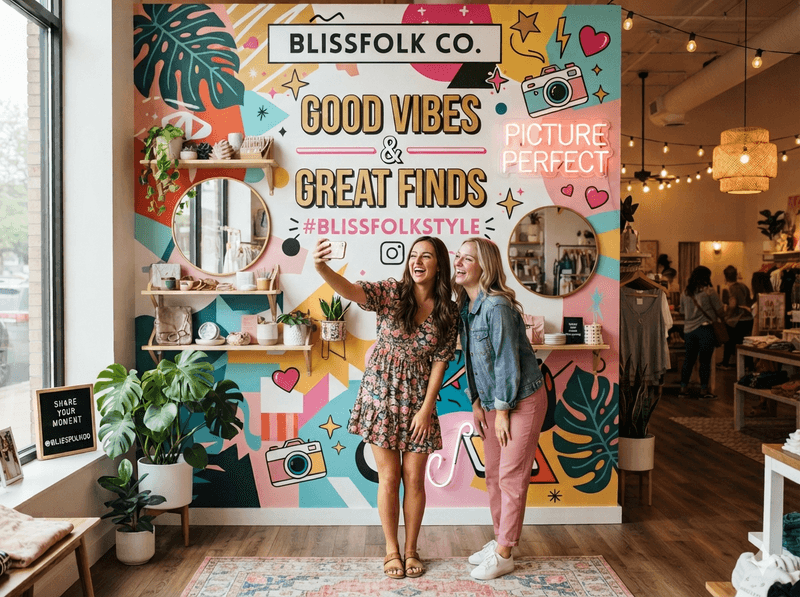
An Instagrammable space is a visually striking physical area designed specifically to encourage visitors to take photos and share them on social media. Businesses build these tailored environments using bold graphics, unique lighting, and compelling typography to seamlessly turn patrons into brand advocates.
Gemini
People actively hunt for memorable backdrops to curate their digital identities. They want their feeds to look incredible. A bare, beige wall offers zero value to a smartphone lens, but a thoughtfully executed selfie wall acts as a visual magnet. It gives your visitors an immediate reason to pause, pose, and post.
When customers share these photos online, they naturally geo-tag your location and tag your profile. Their friends and followers see an authentic, personal endorsement rather than a standard paid advertisement. This consumer habit crowd-sources your visual marketing. You supply the aesthetic backdrop, they deliver the engaged audience.
6 Key Instagrammable Design elements to Know
Throwing up a logo and calling it a day won't cut it. Striking Instagrammable design requires a strategic understanding of how physical materials translate through a camera lens. Keep these technical elements in mind before you go to print:
Legible Typography
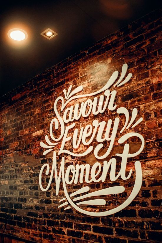
Intricate scripts often turn into a blurry mess on a smartphone screen. If your artwork includes a catchy phrase or a branded hashtag, pick bold fonts. The text needs to read perfectly clearly from at least six feet away.
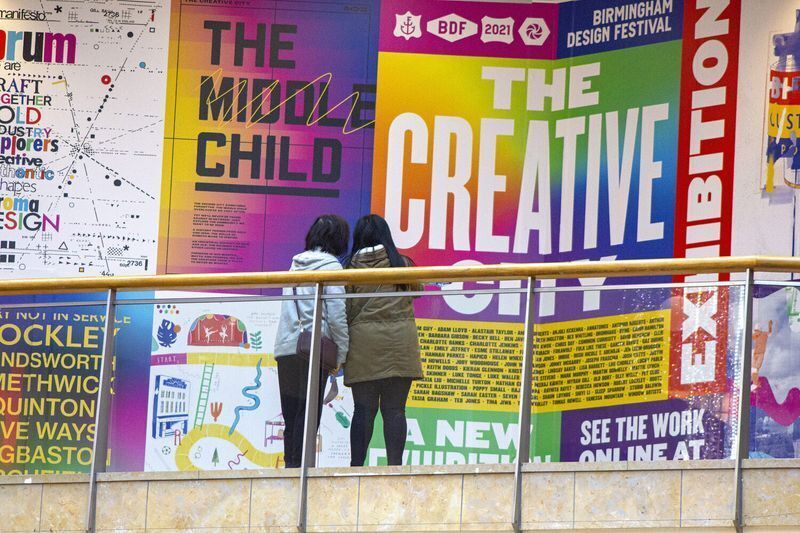
Image via TYPE01
High color contrast
Cameras crave contrast. Subtle pastels look elegant in person but frequently wash out once processed by a mobile sensor. Choose vibrant color palettes. High contrast helps the human subject pop against the background rather than blending into it.
Strategic materials finish
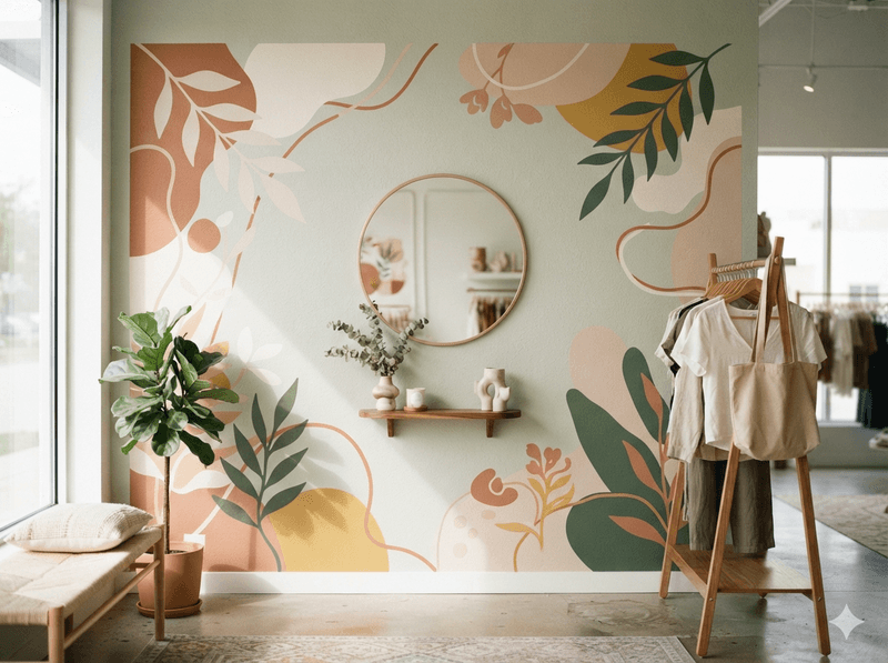
Glare easily ruins a perfect photo. When finalizing your wall graphics design, consider how your chosen material reacts to light. Matte decals remain the safest bet to block reflections from camera flashes.
Gemini
However, you don’t have to avoid shine completely. Glossy finishes, dimensional signage, and window clings offer incredible visual depth. You just need to angle your surrounding light sources correctly to prevent harsh hot spots on reflective surfaces.
Lighting geometry
Placement matters just as much as the artwork itself. Install your graphics near large windows to harness soft, natural sunlight. For windowless areas, adjust your overhead track lighting to hit the print evenly. This specific positioning stops unflattering shadows from forming directly behind the person posing.
Scale and aspect ratios
Today, many social platforms prioritize vertical imagery. A massive horizontal mural might look breathtaking in person, but it forces users to awkwardly crop the design on their phones. Keep the most crucial visual components grouped tightly. Include graphics that fit within a 9:16 aspect ratio on a standard mobile screen.
Subtle brand integration
People want to share cool aesthetics, and plastering a giant logo across the wall can actively discourage customers from taking photos. Weave your brand identity into the design organically instead. Use your brand colors, incorporate a clever mascot, or tuck a small logo into the bottom corner.
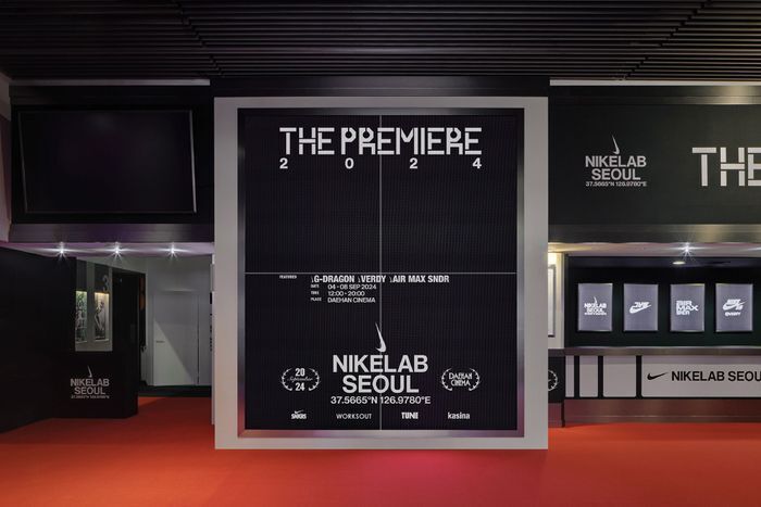
Image via TYPE01
Instagrammable Wall Ideas: 6 Ways to Make Your Wall Graphics Instagram-Worthy
The best Instagrammable designs curate an experience. Here are some actionable ways to maximize your visual real estate.
1. Waiting area anchors
Place your backdrop where customers naturally linger and instinctively reach for their phone. Give them a compelling visual distraction—coffee shop pickup counters, retail fitting room lines, and office reception desks trap people with idle time.
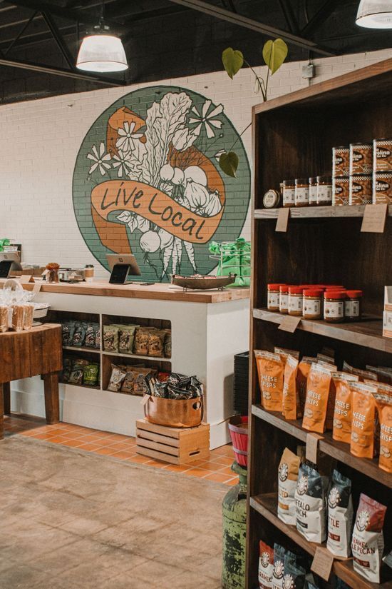
A bold, textured art piece utilizing mounted canvas printing captures that wandering attention perfectly. You can also deploy large poster printing to display stylized, high-resolution lifestyle imagery that resonates with your target demographic. Anchoring these visuals in high-dwell zones can intercept a bored customer and hand them a curated photo opportunity instead.
2. Floor decals for "shoefies"
Not everyone feels comfortable showing their face on camera. Give your camera-shy visitors an engaging alternative by looking down. People frequently snap top-down photos of their footwear—widely known as "shoefies"—against interesting patterns, clever greetings, or branded compass designs.
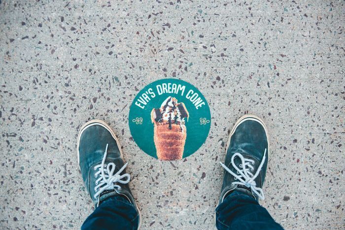
This tactic works exceptionally well near entryways or along checkout lines. Lay down a highly durable, slip-resistant floor graphic that contrasts sharply with your existing tile or concrete. It creates a low-pressure engagement point. Customers get a stylish shot of their outfit, and you secure a subtle brand placement in their social feed.
3. Interactive quotes
Step away from standard, perfectly centered text. Design a catchy, brand-relevant phrase using precision wall decals printing, but intentionally leave a physical gap in the layout. You'll prompt the visitor to stand in that specific empty space, making them a literal piece of the visual narrative.
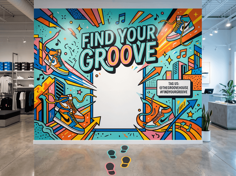
Gemini
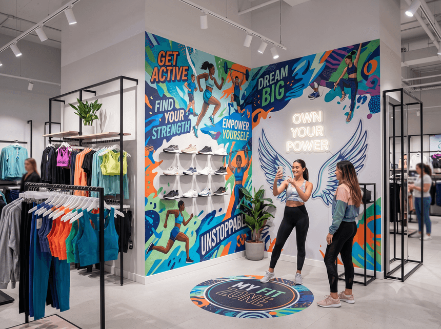
Think of a pair of stylized wings or an oversized speech bubble placed right at shoulder height. You could even integrate dry erase decals printing to let visitors handwrite their own answers to a daily prompt. This shifts passive observers to active participants, significantly boosting the likelihood they'll post the result.
4. Experiential retail wall graphics
Instead of just hanging a small, predictable logo, consider covering an entire accent wall with a sprawling, immersive scene. Thanks to large format printing, you can scale high-resolution imagery across massive surfaces without losing a shred of clarity.
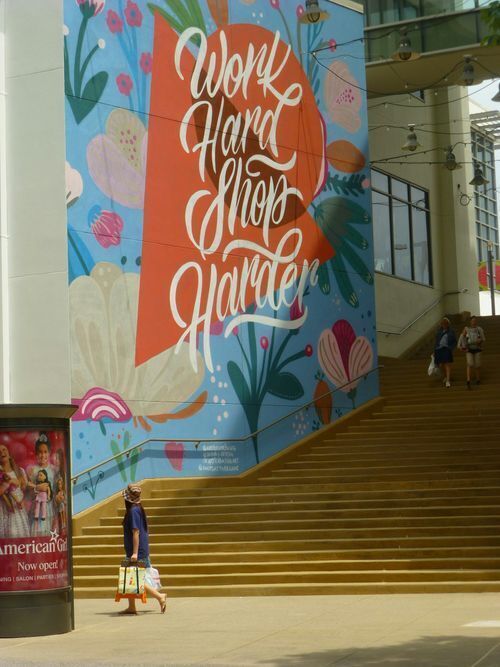
This kind of aggressive scaling works because it completely surrounds your customers in a specific aesthetic, instantly shifting the vibe of your physical store from a standard shopping trip to an exclusive destination.
Think of it as a visual portal; while a surf shop might drop shoppers into a floor-to-ceiling barrel wave, a modern cafe can feature a hyper-realistic macro shot of scattered coffee beans. You plunge the visitor directly into the atmosphere you want them to associate with your products, making the space nearly impossible not to photograph.
5. Seasonal refresh
Stagnant spaces quickly lose their social media appeal because, honestly, nobody wants to post a photo in front of the same backdrop twice. You can keep your local regulars sharing content year-round by rotating your artwork to match changing seasons or major product launches.
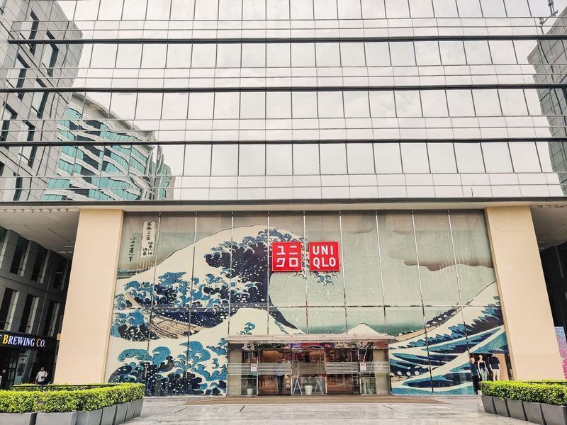
Consider temporary window cling printing on glass storefronts or interior partitions to keep the environment visually fresh without committing to permanent paint or messy renovations. You simply peel down the autumn aesthetic when the time comes and roll out your winter campaign. This constant visual evolution signals to your audience that your location is active, relevant, and always worth a return visit.
6. Wayfinding as art
Pointing customers toward the fitting rooms, checkout lines, or restrooms doesn't mean you have to settle for boring plastic plaques. Turn those mandatory navigation points into a genuine Instagram-worthy wall moment by integrating bold typography and quirky icons right onto your design.
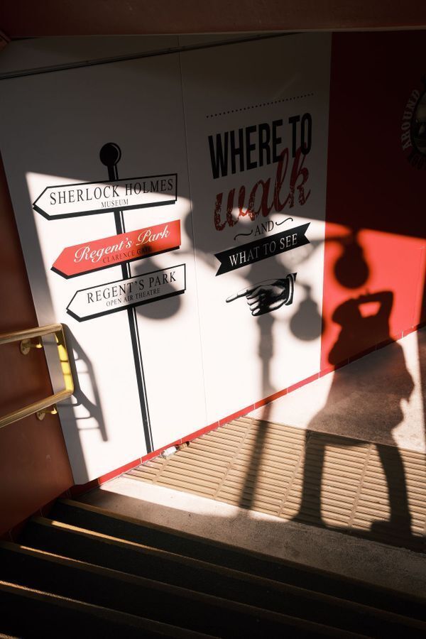
To take it a step further, you can mount interior exterior / dimensional signage to create distinct drop shadows and tangible depth that pops on camera. When you treat functional elements as a creative canvas, you surprise your visitors. A clever restroom sign or a heavily stylized checkout marker frequently becomes the most shared spot in the entire building because it catches people completely off guard.
Selfie-ready checklist
Before you finalize your order and schedule an installation, run your layout through a quick technical check. Even the most stunning artwork falls flat if the physical execution ignores how smartphone cameras operate.
Use this quick-reference table to guarantee your new backdrop functions exactly as intended
| Technical Parameter | The Golden Rule | Why It Matters |
|---|---|---|
| Graphic height | Center your primary logo, focal point, or text between 5 to 6 feet off the ground. | This targets the average adult eye level. When a person steps into the frame, they won't accidentally block the most crucial visual details with their body. |
| Subject distance | Leave a minimum of 3 to 4 feet of clear, unobstructed floor space directly in front of the art. | Visitors need physical room to back up and frame the shot comfortably. Without enough space, they resort to awkward, ultra-wide angles that distort the background. |
| Light positioning | Position your overhead track lights at a 45-degree angle pointing directly toward the surface | Angled lighting washes the entire graphic in a smooth, even glow while preventing deep, unflattering shadows from forming right behind the subject's head |
| Glare reduction | Stick strictly to matte vinyl, non-reflective fabrics, or textured boards for the main artwork. | Flat finishes stop harsh smartphone flashes and portable ring lights from creating massive, blinding white hot-spots over your branding. |
The Final Frame
Start integrating thoughtful, camera-ready visuals to transform passive architecture into a highly effective marketing channel. Give your visitors a compelling reason to pull out their phones, snap a photo, and share your space with their personal networks. It takes a deliberate strategy to bridge the gap between a physical room and a digital feed, but the resulting user-generated content acts as continuous, authentic promotion.
To upgrade your business environment, partner with professionals who understand the mechanics of commercial printing. Intermedia Print Solutions is a trusted print shop in New Jersey that handles everything from custom manual printing and sales kits to product packaging and wall graphics printing. We provide the materials and expertise to execute camera-ready visuals that transform your space.
Ready to build an unforgettable photo op? Request a quote or place your order today to bring your vision to life.
Instagrammable Spaces and Wall Graphics: FAQs
What makes a space Instagrammable?
An Instagrammable space features bold aesthetics, vibrant colors, and clear typography tailored specifically for smartphone cameras. It provides a visually striking backdrop that actively encourages visitors to pause, pose, and share photos online. This intentional design seamlessly transforms ordinary foot traffic into organic social media marketing.
Where should you put a selfie wall?
Install your custom prints in high-dwell areas where customers naturally wait, such as reception desks, coffee pickup counters, or fitting room lines. These locations effectively capture wandering attention. You easily turn frustrating idle time into an engaging, interactive photo opportunity for your visitors.
How do you design a selfie wall?
You create an effective backdrop by balancing high color contrast with easily readable fonts. Scale crucial visual components tightly to fit a standard 9:16 vertical mobile screen. Keeping these focal points grouped closely ensures users won't awkwardly crop your design when snapping a picture.
How high should you mount graphics?
Center your primary logos, hashtags, or text elements roughly five to six feet off the ground. This height precisely targets the average adult eye level. Proper positioning guarantees that your subjects won't accidentally block the most important branding details with their bodies during the shot.
What's the best material for backdrops?
Always use matte vinyl or non-reflective foam boards for your main artwork. Flat finishes eliminate those blinding white hot spots caused by harsh smartphone flashes. If your project demands specialized dimensional signage, explore professional commercial printing options to guarantee a glare-free, camera-ready installation.